
Google Sheets Data Analysis: Automate Reports with n8n and Claude Code
Google Sheets is where most business data lives. Sales figures, marketing metrics, customer feedback, project timelines — it all ends up in spreadsheets. But extracting meaningful insights from that data? That's where most teams get stuck.
This guide shows you how to build automated analysis pipelines that pull data from Google Sheets, process it with AI, and deliver polished reports — all without manual effort.
The Problem with Manual Spreadsheet Analysis
Every week, someone on your team probably does this:
Opens multiple Google Sheets
Copies data into a summary sheet
Creates pivot tables and charts
Writes up findings in an email
Sends it to stakeholders
This process takes 2-4 hours per week and is prone to human error. Worse, the insights are always stale by the time they reach decision-makers.
The solution: automate the entire pipeline using n8n for orchestration and Claude Code for intelligent analysis.
Architecture Overview
Here's the automated pipeline we're building:
Cron Trigger (scheduled)
    ↓
Google Sheets (read data from multiple sheets)
    ↓
Function Node (clean and transform data)
    ↓
AI Node / Claude Code (analyze and generate insights)
    ↓
Google Sheets (write results to summary sheet)
    ↓
Gmail (send formatted report)
    ↓
Slack (post key highlights)
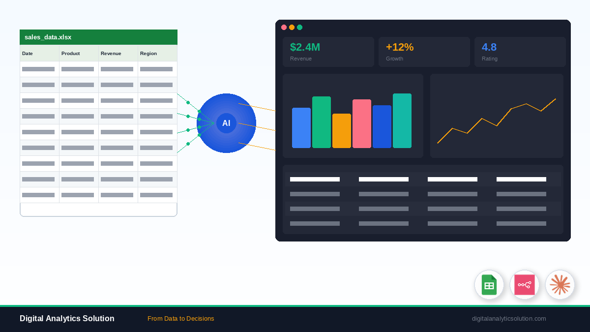
Step 1: Setting Up Data Collection
Configure the Google Sheets Nodes
First, set up n8n to read from your data sources. If you haven't connected Google Workspace to n8n yet, follow our Google Workspace automation guide.
Sales Data Sheet:
Configure a Google Sheets node to read from your sales tracker
Select the relevant columns: date, product, revenue, quantity, region
Marketing Data Sheet:
Add another Google Sheets node for marketing metrics
Columns: date, channel, spend, clicks, conversions
Customer Feedback Sheet:
A third node for customer satisfaction data
Columns: date, rating, category, comment
Schedule the Trigger
Use a Cron node to run the workflow on your preferred schedule:
Daily digest: Every day at 8 AM
Weekly report: Every Monday at 9 AM
Monthly summary: First day of each month
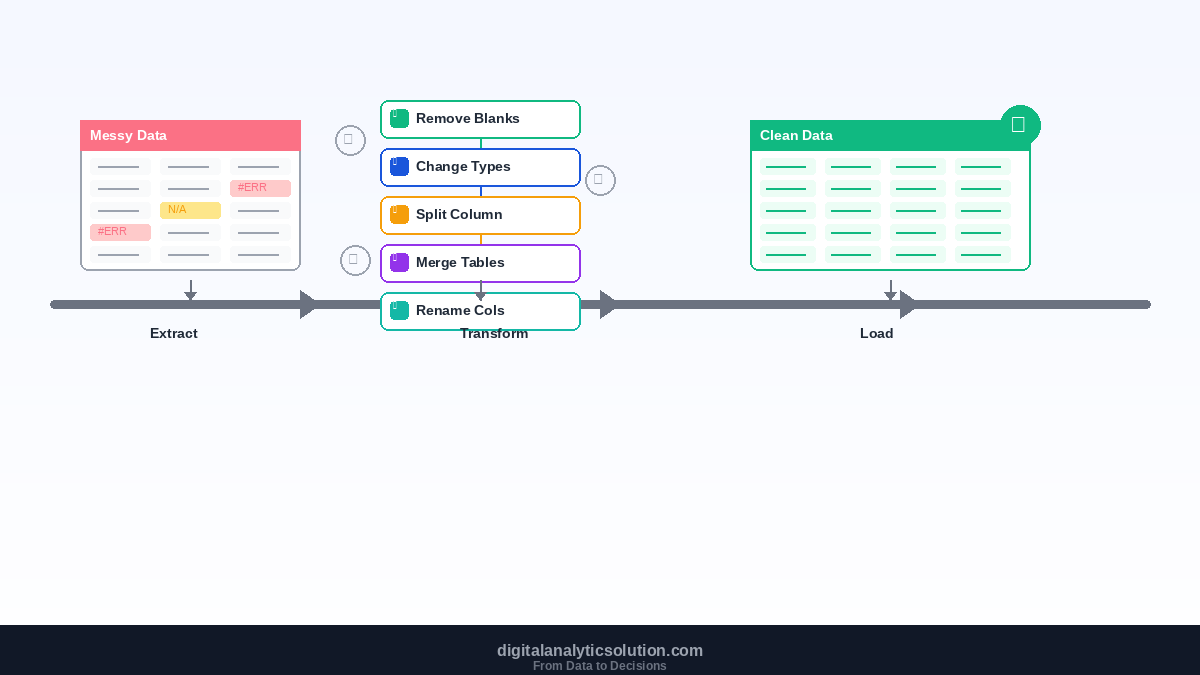
Step 2: Data Cleaning and Transformation
Raw spreadsheet data is rarely analysis-ready. Use n8n's Function node to clean it up:
// Example: Clean and normalize sales data
const cleanedData = items.map(item => ({
  date: new Date(item.json.date).toISOString().split('T')[0],
  product: item.json.product.trim().toLowerCase(),
  revenue: parseFloat(item.json.revenue) || 0,
  quantity: parseInt(item.json.quantity) || 0,
  region: item.json.region.trim()
}));

// Remove duplicates
const unique = cleanedData.filter((item, index, self) =>
  index === self.findIndex(t =>
    t.date === item.date && t.product === item.product
  )
);

return unique.map(item => ({ json: item }));
Common cleaning operations:
Standardize dates across different formats
Remove duplicates from multi-source data
Handle missing values with defaults or interpolation
Normalize text (trim whitespace, consistent casing)
Validate numeric data (convert strings, handle nulls)
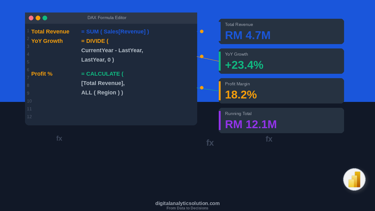
Step 3: AI-Powered Analysis
This is where the magic happens. Use Claude Code or n8n's AI nodes to perform intelligent analysis that goes beyond simple aggregations.
Basic Statistical Analysis
Configure an AI node with this prompt pattern:
Analyze the following sales data and provide:
1. Total revenue and comparison to previous period
2. Top 5 products by revenue with growth trends
3. Regional performance breakdown
4. Anomalies or unusual patterns
5. Three actionable recommendations

Data: {{ $json.salesData }}
Trend Detection
Given the following 12-month revenue data, identify:
- Overall trend direction and strength
- Seasonal patterns
- Inflection points where growth accelerated or slowed
- Projected revenue for next 3 months

Format the response as structured JSON.
Sentiment Analysis on Feedback
Analyze these customer feedback comments:
- Categorize each by theme (product, service, pricing, UX)
- Rate overall sentiment (positive/neutral/negative)
- Identify the top 3 most mentioned issues
- Highlight any urgent concerns requiring immediate attention

Feedback: {{ $json.feedbackData }}
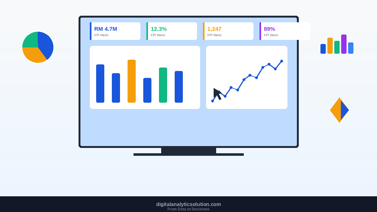
Step 4: Writing Results Back to Google Sheets
Create a summary dashboard sheet in Google Sheets and have n8n populate it automatically:
Dashboard Layout
Section | Content |
|---|---|
Row 1-3 | Key metrics (revenue, growth, satisfaction score) |
Row 5-15 | Top products table |
Row 17-27 | Regional breakdown |
Row 29-35 | AI-generated insights |
Row 37+ | Trend data for charts |
Use the Google Sheets "Update Row" or "Append Row" operation to write data to specific cells. The charts in Google Sheets will update automatically based on the new data.
Step 5: Delivering the Report
Email Report
Use the Gmail node to send a formatted HTML email:
<h2>Weekly Business Report — {{ $now.format('MMM D, YYYY') }}</h2>

<h3>Key Metrics</h3>
<table>
  <tr><td>Total Revenue</td><td>{{ $json.totalRevenue }}</td></tr>
  <tr><td>Growth vs Last Week</td><td>{{ $json.growthRate }}%</td></tr>
  <tr><td>Customer Satisfaction</td><td>{{ $json.satisfactionScore }}/5</td></tr>
</table>

<h3>AI Insights</h3>
<p>{{ $json.aiInsights }}</p>

<p><a href="{{ $json.dashboardLink }}">View Full Dashboard</a></p>
Slack Highlights
Post key findings to a Slack channel for quick visibility:
📊 *Weekly Report Highlights*

💰 Revenue: ${{ revenue }} ({{ growthDirection }} {{ growthRate }}%)
📈 Top Product: {{ topProduct }}
⚠️ Alert: {{ urgentInsight }}

Full report: {{ dashboardLink }}
Advanced Techniques
Multi-Sheet Aggregation
When your data spans dozens of sheets, use n8n's loop functionality to iterate through a list of sheet IDs and aggregate data programmatically.
Historical Comparison
Store analysis results over time to enable week-over-week and month-over-month comparisons. Create a dedicated "History" sheet where each run appends its summary metrics.
Conditional Alerting
Add IF nodes to trigger special alerts only when metrics cross thresholds:
Revenue drops more than 10% week-over-week
Customer satisfaction falls below 4.0
A single product accounts for more than 50% of revenue (concentration risk)
Integration with Data Pipelines
For more complex data processing, connect this workflow to a full data pipeline built with n8n that pulls from databases, APIs, and other sources beyond Google Sheets.
Results You Can Expect
Teams implementing this automated analysis pipeline typically see:
4-6 hours saved weekly on manual reporting
Faster decision-making with real-time insights delivered automatically
Fewer errors from eliminated manual data handling
Deeper insights from AI-powered analysis that humans might miss
Better engagement with data as stakeholders receive consistent, well-formatted reports
What's Next?
This workflow is a powerful starting point, but it's just one piece of the puzzle. To build a comprehensive data and automation ecosystem:
Learn to build complete data pipelines with n8n for more complex data flows
Explore vibes coding with Claude Code to build custom dashboards for your data
Read about the complete automation stack to see how all these tools work together
Need more Google Workspace automations beyond data analysis? Check out our full guide: How to Automate Google Workspace with n8n.