
Getting Started with Power BI: Your First Dashboard in Under an Hour
You have a spreadsheet full of sales data. Your manager wants a visual summary by end of day. You could spend hours formatting charts in Excel, or you could open Power BI and build something genuinely impressive in under 60 minutes.
Power BI is Microsoft's business intelligence tool that turns raw data into interactive dashboards and reports. It is free to download, connects to almost any data source, and produces visuals that make stakeholders pay attention.
This guide walks you through everything you need to go from zero to your first working dashboard.
What is Power BI?
Power BI is a suite of tools for data analysis and visualisation. The core product, Power BI Desktop, is a free Windows application where you build reports. Power BI Service is the cloud platform where you publish and share those reports. Power BI Mobile lets you view dashboards on your phone.
For this guide, you only need Power BI Desktop.
What makes Power BI different from Excel charts:
Interactive filtering: click on one chart and every other visual on the page updates automatically
Data modelling: connect multiple tables and define relationships, just like a database
Scalability: handle millions of rows without your file crashing
Sharing: publish to the web so your team can access dashboards from any browser
Automatic refresh: schedule data updates so your reports are always current
Step 1: Download and Install Power BI Desktop
Head to the Microsoft Power BI website and download Power BI Desktop. It is also available through the Microsoft Store on Windows.
The installation is straightforward. Accept the defaults and you are ready in about five minutes.
Note: Power BI Desktop runs on Windows only. If you are on macOS, you can use Power BI Service (web version) or run a Windows virtual machine.
Step 2: Connect Your First Data Source
When you open Power BI Desktop, you will see a blank canvas. Your first task is to bring in data.
Click Get Data on the Home ribbon. You will see a long list of connectors. The most common ones for beginners:
Excel workbook - your existing spreadsheets
CSV / Text file - exported data from other systems
SQL Server - direct database connection
Web - data from online tables
SharePoint - files stored in your organisation's SharePoint
For this tutorial, let us use a simple Excel file. Suppose you have a file called sales_data.xlsx with columns: Date, Product, Region, Revenue, and Units Sold.
Click Get Data > Excel Workbook
Browse to your file and click Open
Select the sheet or table you want to import
Click Load
Your data now appears in the Fields pane on the right side of the screen.
Step 3: Explore the Power BI Interface
Before building visuals, familiarise yourself with the layout:
Report view (default): where you design your dashboard pages
Data view: see your imported data in table format, similar to Excel
Model view: see how your tables relate to each other
Fields pane (right): lists all your tables and columns
Visualisations pane (right): choose chart types and configure them
Filters pane (right): apply filters to individual visuals, pages, or the entire report
Step 4: Build Your First Visuals
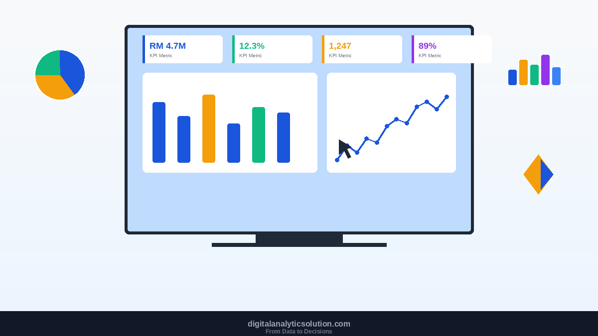
Now for the satisfying part. Let us build four visuals that form a complete sales dashboard.
Visual 1: Total Revenue Card
Click on the blank canvas
In the Visualisations pane, select the Card visual
Drag Revenue from the Fields pane into the visual
Power BI automatically sums the revenue and displays a single number
Format it: click the format roller icon, turn on the title, type "Total Revenue"
Visual 2: Revenue by Region (Bar Chart)
Click on empty space on the canvas
Select the Clustered Bar Chart visual
Drag Region to the Y-axis
Drag Revenue to the X-axis
Power BI creates a horizontal bar chart showing revenue per region
Visual 3: Monthly Trend (Line Chart)
Click on empty space
Select the Line Chart visual
Drag Date to the X-axis (Power BI auto-creates a date hierarchy)
Drag Revenue to the Y-axis
Click on the date hierarchy to drill down from year to quarter to month
Visual 4: Product Performance (Table)
Click on empty space
Select the Table visual
Drag Product, Units Sold, and Revenue into the Values area
The table displays a clean summary of each product's performance
The Magic of Cross-Filtering
Here is where Power BI truly shines. Click on any bar in your Region chart. Notice how every other visual on the page instantly filters to show only that region's data. Click again to deselect. This interactivity happens automatically with no extra configuration.
Step 5: Format Your Dashboard
A good dashboard needs more than data. It needs clarity.
Add a title: Insert a text box from the Insert ribbon. Type your dashboard name, set the font to 20pt bold, and position it at the top.
Apply a consistent colour theme: Go to View > Themes and pick a theme, or create a custom one using your organisation's brand colours. If you are using the Digital Analytics Solution brand palette, set your primary visual colour to #1A56DB and accent to #F59E0B.
Align your visuals: Select multiple visuals, then use Format > Align to snap them into a clean grid layout.
Remove clutter: Turn off unnecessary axis labels, gridlines, and borders. Every element on the dashboard should earn its place.
Step 6: Save and Share
Save your .pbix file locally. When you are ready to share:
Click Publish on the Home ribbon
Sign in with your Microsoft work or school account
Select a workspace in Power BI Service
Your report is now live on the web
Share the link with your team, or embed the dashboard in Microsoft Teams or SharePoint.
Common Beginner Mistakes to Avoid
Putting too many visuals on one page. A dashboard with 15 charts is not a dashboard; it is a mess. Aim for 4 to 6 focused visuals per page. Use multiple pages for different perspectives.
Ignoring the data model. If you have multiple tables, define relationships in the Model view before building visuals. Without proper relationships, your numbers will be wrong.
Using pie charts for everything. Pie charts work for 2 to 3 categories at most. For anything more, use a bar chart. Your audience will thank you.
Not formatting numbers. Raw numbers like 1234567.89 are hard to read. Format revenue as currency, percentages as %, and large numbers with thousands separators.
What to Learn Next
Once you are comfortable building basic dashboards, your next steps are:
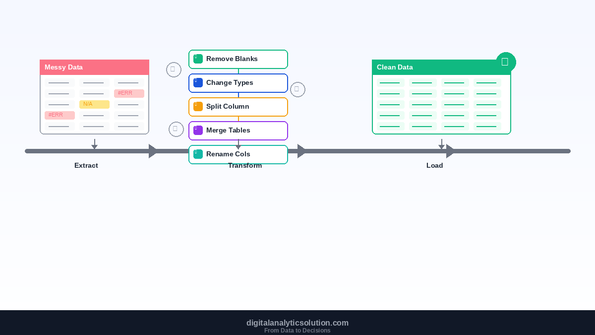
Power Query for Data Cleaning: learn how to clean and transform messy data before it reaches your visuals
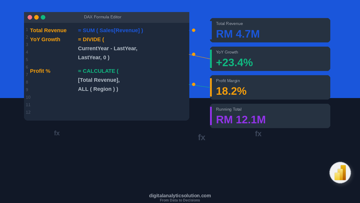
Introduction to DAX: write formulas for calculated columns and measures that go beyond simple sums
Dashboard Design Principles: design dashboards that communicate clearly and drive decisions
Data Storytelling: turn your dashboards into compelling narratives that influence action
If you are also exploring automation, check out how to build data pipelines with n8n that feed directly into your Power BI reports, or use Google Sheets analysis with n8n and Claude Code as an upstream data preparation layer.
Summary
Power BI is one of the most accessible tools for turning data into decisions. You installed it, connected data, built four interactive visuals, formatted the layout, and published it to the web. All in under an hour.
The real power comes not from individual charts, but from the interactivity between them. A single click on your dashboard reveals patterns that would take hours to uncover in a spreadsheet.
Start with one dataset you know well. Build a simple dashboard. Show it to someone. That feedback loop is the fastest way to improve.
This article is part of the Digital Analytics Solution content series. Explore the full series to build your skills in automation, AI-assisted development, and data analytics.