
Data Storytelling with Power BI: Turn Numbers into Narratives That Drive Action
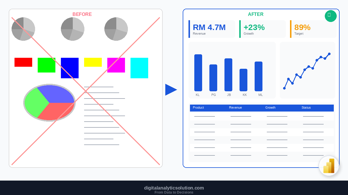
You have built a Power BI dashboard with clean data, accurate DAX measures, and a well-designed layout. You present it to the leadership team. They look at it, nod politely, and move on to the next agenda item.
What went wrong? The data was correct. The visuals were clear. But no one took action.
The missing piece is data storytelling. A dashboard full of charts is information. A dashboard that guides the viewer through a narrative, highlights what matters, and points to a clear recommendation is a story. And stories drive decisions.
What is Data Storytelling?
Data storytelling is the practice of combining data, visuals, and narrative to communicate insights in a way that is memorable, persuasive, and actionable.
It sits at the intersection of three skills:
Data analysis: finding patterns, trends, and anomalies in the numbers
Visualisation: choosing the right charts and visual elements to represent those findings
Narrative: structuring the findings into a logical flow with context, tension, and resolution
Remove any one element and the impact drops. Data without narrative is a spreadsheet. Narrative without data is an opinion. Data with narrative but poor visuals is a missed opportunity.
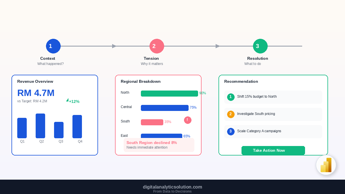
The Three-Act Structure for Data Stories
Every compelling data story follows a structure similar to traditional storytelling.
Act 1: Context (The Setup)
Set the scene. What is the situation? What does the audience already know? What are we measuring and why?
In Power BI terms, this is your overview page: KPI cards showing current performance, a brief text element stating the time period and scope, and a comparison to the target or previous period.
Example: "In Q1 2026, our total revenue reached RM 4.7M, which is 12% above the RM 4.2M target. However, the growth is not evenly distributed."
The context establishes the baseline. Without it, everything that follows lacks meaning.
Act 2: Tension (The Conflict)
What is the surprise, the problem, or the unexpected finding? This is where you hold the viewer's attention.
In Power BI, this is your breakdown page: charts showing regional performance, product comparisons, or time-series trends that reveal where the story gets interesting.
Example: "Northern Region grew 34% year-over-year, while Southern Region declined 8%. Three product categories account for 78% of total growth, while two categories are underperforming against last year."
Tension creates urgency. It transforms a report from "here are the numbers" to "here is a problem worth solving."
Act 3: Resolution (The Recommendation)
What should the audience do about it? This is the most overlooked part of data storytelling. Most dashboards end at the tension without guiding the viewer toward action.
In Power BI, this could be a summary page with annotated visuals, a recommendation text box, or a drill-through page showing specific actions.
Example: "Recommendation: Reallocate 15% of the Southern Region marketing budget to Northern Region campaigns that are demonstrating 3x higher conversion rates. Additionally, investigate the pricing decline in Category B which has dropped 12% since November."
The resolution turns insights into decisions.
Storytelling Techniques for Power BI
Technique 1: Lead with the Headline
Do not make your audience hunt for the insight. State it explicitly.
Instead of titling a chart "Monthly Revenue by Region", write "Northern Region Drives 60% of Q1 Revenue Growth". The insight is in the title. The chart provides the evidence.
In Power BI, you can use dynamic titles with DAX measures:
Chart Title =
VAR TopRegion =
    TOPN(1, VALUES(Sales[Region]), [Total Revenue], DESC)
VAR TopPct =
    DIVIDE(
        CALCULATE([Total Revenue], TOPN(1, VALUES(Sales[Region]), [Total Revenue], DESC)),
        [Total Revenue]
    )
RETURN
    CONCATENATE(TopRegion, " accounts for " & FORMAT(TopPct, "0%") & " of total revenue")
Technique 2: Use Annotations and Callouts
Power BI allows you to add text boxes, shapes, and images to your report pages. Use them to annotate key data points.
Place a text callout next to a spike in your line chart: "Product launch in June drove a 45% increase." Add an arrow pointing to the anomaly. This guides the viewer's eye to what matters instead of hoping they notice it themselves.
Technique 3: Show Comparisons, Not Just Values
A number without context is meaningless. Always show data relative to something:
vs Target: "RM 4.7M revenue vs RM 4.2M target" (112% achievement)
vs Previous Period: "Revenue up 18% compared to Q1 2025"
vs Benchmark: "Our conversion rate of 3.2% is above the industry average of 2.1%"
In Power BI, use KPI visuals, bullet charts, or side-by-side bar charts to make comparisons obvious.
Technique 4: Progressive Disclosure
Do not show everything at once. Layer your story across multiple pages.
Page 1 (Executive Summary): 4 to 5 KPI cards and one headline chart. This is the 30-second view. If someone has no time, this page tells them enough.
Page 2 (Deep Dive): Detailed breakdown by dimension (region, product, time). This is the 5-minute view for managers who want to understand the "why" behind the numbers.
Page 3 (Action Items): Specific findings and recommendations with supporting evidence. This is the view that drives meetings and decisions.
Use Power BI's page navigation buttons or bookmarks to guide users through this flow.
Technique 5: Highlight the Anomaly
The most interesting data point is usually the outlier, the exception, or the unexpected trend. Draw attention to it.
Conditional formatting in tables and matrices can highlight cells that exceed thresholds. Set revenue cells to turn red when below target and green when above.
Reference lines on charts mark benchmarks and targets. A horizontal line showing "RM 500K monthly target" on a line chart instantly shows which months fell short.
Colour saturation can emphasise anomalies. Show most data points in gray and highlight the anomaly in your brand's primary blue (#1A56DB). The contrast draws the eye immediately.
Technique 6: Use the Right Chart for the Story
Different stories require different visual treatments:
Story Type | Best Chart | Example |
|---|---|---|
"How are we performing?" | KPI cards + gauge | Revenue vs target |
"What changed over time?" | Line chart | Monthly revenue trend |
"How do groups compare?" | Horizontal bar chart | Revenue by region |
"What is the breakdown?" | Stacked bar or treemap | Revenue by product and category |
"Is there a relationship?" | Scatter plot | Price vs volume correlation |
"Where are the outliers?" | Box plot or scatter | Unusual transaction patterns |
"What is the distribution?" | Histogram | Customer spend distribution |
Technique 7: Close with a Clear Recommendation
The most impactful data stories end with a specific, actionable recommendation. Not "we should investigate further" but "we should shift RM 200K in ad spend from Channel A to Channel B, which is generating leads at 40% lower cost."
Add a dedicated text element or a formatted table on your final page that lists:
The finding (what the data shows)
The implication (why it matters)
The recommendation (what to do about it)
The expected impact (what changes if we act)
Building a Data Story: Step by Step
Here is a practical workflow for creating a data-driven narrative in Power BI:
Step 1: Analyse first, design second. Before opening Power BI, explore your data. What are the key trends? What surprised you? What would your audience care about? Write down 3 key findings.
Step 2: Define your audience. Are you presenting to the CEO (keep it strategic), the marketing team (keep it tactical), or the entire company (keep it simple)? Adjust your depth and terminology accordingly.
Step 3: Structure your narrative. Write a one-paragraph summary of your story: the context, the tension, and the recommendation. This becomes your guide for which visuals to build.
Step 4: Build the supporting visuals. Create only the charts that support your narrative. Resist the urge to add visuals "just in case." Every chart should answer a specific question in your story.
Step 5: Add narrative elements. Titles that state insights, annotations on key data points, comparison indicators, and a clear recommendation section.
Step 6: Test with a colleague. Show your dashboard to someone unfamiliar with the data. Can they understand the story within 2 minutes? Can they state the key finding and recommendation? If not, simplify.
The Presenter's Toolkit in Power BI
Power BI has features specifically designed for storytelling and presentation:
Bookmarks let you save specific view states (filters, visible visuals, page positions) and switch between them. Create a "guided tour" by linking bookmarks to buttons.
Drillthrough pages let users right-click on a data point and navigate to a detail page pre-filtered for that item. The viewer controls the depth of exploration.
Tooltips can show additional context on hover. Create a custom tooltip page with a mini-chart that appears when someone hovers over a data point.
Smart Narratives is a Power BI visual that generates natural language descriptions of your data automatically. It is useful as a starting point, though you should customise the output to match your brand voice.
Common Storytelling Mistakes
Starting with the tool, not the insight. Opening Power BI before you know what story to tell leads to dashboard sprawl. Analyse and outline first.
Telling too many stories at once. One dashboard, one story. If you have multiple findings, create multiple pages with a clear navigation structure.
Forgetting the "so what." Every chart should answer "so what?" If you cannot explain why a visual matters, the viewer certainly will not be able to either.
Overloading with detail. The executive team does not need a 50-row table. Give them the headline and offer drill-down for those who want more.
Presenting data without recommendations. Data without action is just a report. Always close with what should happen next.
What to Learn Next
Data storytelling is the skill that makes all your other analytics skills visible to decision-makers. Build on this foundation:
Dashboard Design Principles: ensure your visual foundation supports your story
Introduction to DAX: create the calculated measures that power your narrative
Power Query for Data Cleaning: guarantee clean, trustworthy data behind your story
Getting Started with Power BI: foundational Power BI skills if you are just beginning
For AI-powered approaches to data analysis and narrative generation, explore data analysis with Claude Code or discover how vibes coding can help you build custom data tools through natural language descriptions.
Summary
Data storytelling is what separates analysts who produce reports from analysts who drive decisions. The framework is straightforward: set the context, create tension with unexpected findings, and resolve with a clear recommendation.
Every Power BI visual you build should serve the story. Every title should state an insight, not just a label. Every dashboard should end with a specific action the viewer can take.
The goal is never to show all the data. The goal is to show the right data, in the right sequence, with enough context that the right decision becomes obvious.
This article is part of the Digital Analytics Solution content series. Explore the full series to build your skills in automation, AI-assisted development, and data analytics.