
Dashboard Design Principles: Build Power BI Reports People Actually Use
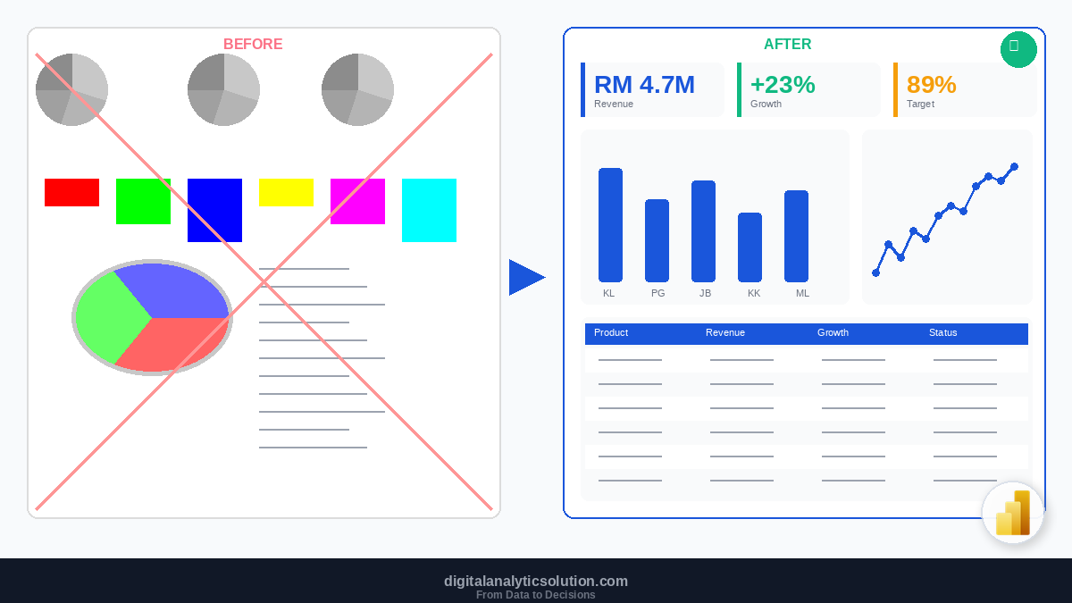
A dashboard crammed with 20 visuals, rainbow colours, and 3D pie charts is not a dashboard. It is a wall of confusion. The best dashboards are the ones where the viewer glances at the screen and immediately understands what matters.
Good dashboard design is not about making things pretty. It is about making data clear, actionable, and impossible to misread. This guide covers the principles that separate dashboards people ignore from dashboards people rely on every day.
The Purpose of a Dashboard
Before designing anything, answer one question: What decision does this dashboard help someone make?
A sales dashboard might answer: "Are we on track for our quarterly target?" A marketing dashboard might answer: "Which channels are generating quality leads?" An operations dashboard might answer: "Where are the bottlenecks in our process?"
If you cannot state the purpose in one sentence, your dashboard is trying to do too much. Split it into multiple focused pages instead.
Three Dashboard Types
Strategic dashboards are for executives and senior leaders. They show high-level KPIs, trends, and comparisons against targets. Minimal detail, maximum clarity. Updated weekly or monthly.
Analytical dashboards are for analysts and managers. They provide drill-down capability, filters, and detailed breakdowns. Users explore the data to find answers to specific questions. Updated daily or in near real-time.
Operational dashboards are for front-line teams. They monitor live processes, flag anomalies, and show current status. Minimal historical context, maximum immediacy. Updated in real-time or every few minutes.
Each type demands different design choices. A strategic dashboard with 50 filter options is as bad as an operational dashboard updated monthly.
Principle 1: Visual Hierarchy
Your dashboard should guide the eye from most important to least important, naturally.
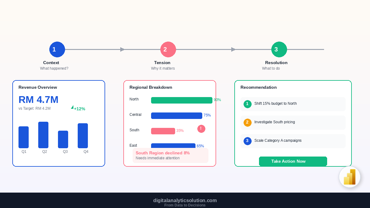
Place KPIs at the top. Card visuals showing the 3 to 5 most critical numbers should sit at the very top of your dashboard. Total Revenue, YoY Growth, Customer Count, Target Achievement. The viewer gets the headline before anything else.
Use the Z-pattern. Readers in left-to-right languages scan in a Z shape: top-left to top-right, then diagonally to bottom-left, then across to bottom-right. Place your most important chart in the top-left quadrant and your supporting detail in the lower sections.
Size signals importance. A large visual draws attention before a small one. Make your primary chart larger than supporting visuals. If everything is the same size, nothing feels important.
Group related items. Revenue charts should be near other revenue-related visuals. Do not scatter related information across the page. Use visual proximity and consistent spacing to create logical groups.
Principle 2: Choose the Right Chart
The wrong chart type can mislead your audience even when the data is correct.
Use bar charts for comparisons. Comparing revenue across 8 regions? Horizontal bar chart. The eye compares bar lengths accurately and labels fit neatly beside each bar.
Use line charts for trends over time. Monthly revenue over the past 2 years? Line chart. Lines imply continuity and direction, which is exactly what time-series data represents.
Use cards for single KPIs. Total Revenue, Average Order Value, Customer Count. One number, clearly formatted, with an optional comparison indicator (up/down arrow).
Use tables for detailed reference. When users need to look up specific values, a well-formatted table beats any chart. Add conditional formatting (data bars, colour scales) to make patterns visible.
Use scatter plots for relationships. Comparing two measures across many items (e.g., revenue vs profit margin by product)? Scatter plots reveal clusters and outliers.
Avoid pie charts (most of the time). Pie charts fail when they have more than 3 slices because humans are poor at comparing angles and areas. If you must show part-to-whole relationships, use a 100% stacked bar chart or a treemap instead.
Never use 3D charts. 3D effects distort data perception. A 3D bar chart makes some bars look larger or smaller than they actually are. Always use flat, 2D visuals.
Principle 3: Colour with Purpose
Colour should communicate meaning, not decoration.
Limit your palette. Use 2 to 3 primary colours maximum for data series. If you are using the Digital Analytics Solution brand, your primary palette is #1A56DB (blue) for main data, #F59E0B (gold) for highlights, and #10B981 (green) for positive indicators. Everything else is #1F2937 (dark) or #6B7280 (gray).
Use colour consistently. If "Kuala Lumpur" is blue on one chart, it must be blue on every chart. Inconsistent colours force the viewer to re-learn the legend on every visual.
Reserve red and green for meaning. Red means below target or negative. Green means above target or positive. Do not use red for a product category or green for a random data series. These colours carry inherent meaning that you should not override.
Use gray for context. When comparing one series against a benchmark or previous period, show the benchmark in gray. Gray recedes visually, keeping focus on the primary data.
Account for colour blindness. About 8% of men and 0.5% of women have some form of colour vision deficiency. Never rely on colour alone to communicate meaning. Pair colour with labels, patterns, or position.
Principle 4: Remove the Clutter
Every element on your dashboard should earn its place. If it does not help the viewer understand or decide, remove it.
Remove chart borders and boxes. Clean white space separates visuals more effectively than drawn borders.
Minimise gridlines. If your chart has gridlines, make them light gray (#E5E7EB) or remove them entirely. The data itself should be the most prominent element.
Remove unnecessary legends. If your chart has only one data series, the legend adds nothing. Remove it and use the chart title instead.
Simplify axis labels. "Revenue (in RM Thousands)" on the axis is better than showing "RM 10,000, RM 20,000, RM 30,000..." for every gridline. Format large numbers with K (thousands) or M (millions).
Avoid decorative elements. Background images, gradient fills, and decorative shapes are noise. Your dashboard is a decision tool, not a poster.
Limit fonts to one or two. Use a single font family (like Inter or Segoe UI). Vary weight (regular vs bold) and size for hierarchy, not different fonts.
Principle 5: Design for Interaction
Power BI dashboards are interactive by default. Design for it.
Make slicers visible and logical. Place date slicers and key filters at the top of the page. Users expect controls at the top. Use dropdown slicers when there are many options to conserve space.
Provide clear filter feedback. Users should always know what filters are active. Consider adding a text box that dynamically shows the current filter state, or use Power BI's visual header filter icon.
Use bookmarks for guided navigation. Create bookmarks for common views ("This Quarter", "Year-to-Date", "Regional Breakdown") and add buttons that switch between them. This guides users to the views that matter most.
Design for drill-through. Summary pages should link to detail pages. A user clicks on a product category and is taken to a detailed product analysis page. Set up drill-through pages in Power BI for this purpose.
Consider mobile layout. Many stakeholders check dashboards on their phones. Power BI lets you create a mobile-optimised layout for each page. Prioritise the top 3 to 4 visuals for the mobile view.
Principle 6: Layout and Spacing
A well-structured layout makes complex data feel manageable.
Use a grid system. Align all visuals to a consistent grid. Power BI has snap-to-grid functionality. Use it. Misaligned visuals make a dashboard look amateur, even if the data is excellent.
Maintain consistent spacing. Use 16px or 24px gaps between visuals. Consistent spacing creates visual rhythm and helps the viewer parse the layout.
Leave white space. Do not fill every pixel. White space (or negative space) reduces cognitive load and makes each visual easier to read individually.
Use pages, not scrolling. If your dashboard requires scrolling, it has too much on one page. Create multiple pages: an overview page for high-level KPIs, detail pages for each topic area. Use tabs or bookmarks for navigation.
Standard dashboard layout pattern:
Row 1: KPI cards (3 to 5 key numbers)
Row 2: Primary chart (large, takes 50 to 60% of width) + secondary chart
Row 3: Supporting visuals or detailed table
Row 4: Filters/slicers (or place at top if preferred)
Principle 7: Tell a Story
A dashboard is not a collection of charts. It is a narrative.
Order visuals by logic, not aesthetics. Start with the big picture (total revenue), then break it down (revenue by region), then show the detail (revenue by product by region). This follows the information hierarchy: overview, comparison, detail.
Use titles that state the insight. "Revenue by Region" is a label. "Northern Region Leads Revenue Growth at 23%" is an insight. When the title itself communicates the key finding, the viewer does not need to interpret the chart.
Add context to every number. A revenue figure of RM 2.3M means nothing without context. Is that good or bad? Show it next to the target, the previous period, or the average. Context turns data into information.
Use conditional formatting. Highlight values that need attention. Red text for below target, green for above. Data bars in tables to show relative magnitudes. Icon sets for status indicators.
For a deeper dive into presenting data persuasively, read our guide on Data Storytelling with Power BI.
Common Design Mistakes
The "everything dashboard." Trying to show every KPI on one page. Split into focused pages with clear navigation.
Rainbow colour schemes. Using 10 different colours for 10 data series. Group minor categories into "Other" and use a limited palette.
Pie chart overuse. Three pie charts on one page is three too many in most cases. Replace with bar charts or stacked bars.
Missing context. Cards showing numbers without comparison to targets, previous periods, or benchmarks.
Ignoring the audience. A dashboard for the CEO should look very different from a dashboard for the operations team. Know your audience before you design.
What to Learn Next
Dashboard design is the bridge between data and decisions. Continue building your skills:
Data Storytelling with Power BI: transform your dashboards into persuasive presentations
Getting Started with Power BI: build your first dashboard from scratch
Introduction to DAX: create the calculated measures your dashboards need
Power Query for Data Cleaning: ensure clean data behind every visual
If you are building automated reporting pipelines, explore 10 essential n8n workflows for business to automate data collection, or learn how to combine your entire stack in the complete automation guide.
Summary
Great dashboards are not about fancy charts or flashy colours. They are about clarity: the right information, in the right order, with the right context, presented so cleanly that the viewer can make a decision in seconds.
Follow these seven principles: establish visual hierarchy, choose appropriate charts, use colour with purpose, remove clutter, design for interaction, structure your layout, and tell a story. Apply them consistently, and your dashboards will be the ones people open first every morning.
This article is part of the Digital Analytics Solution content series. Explore the full series to build your skills in automation, AI-assisted development, and data analytics.